Sketches
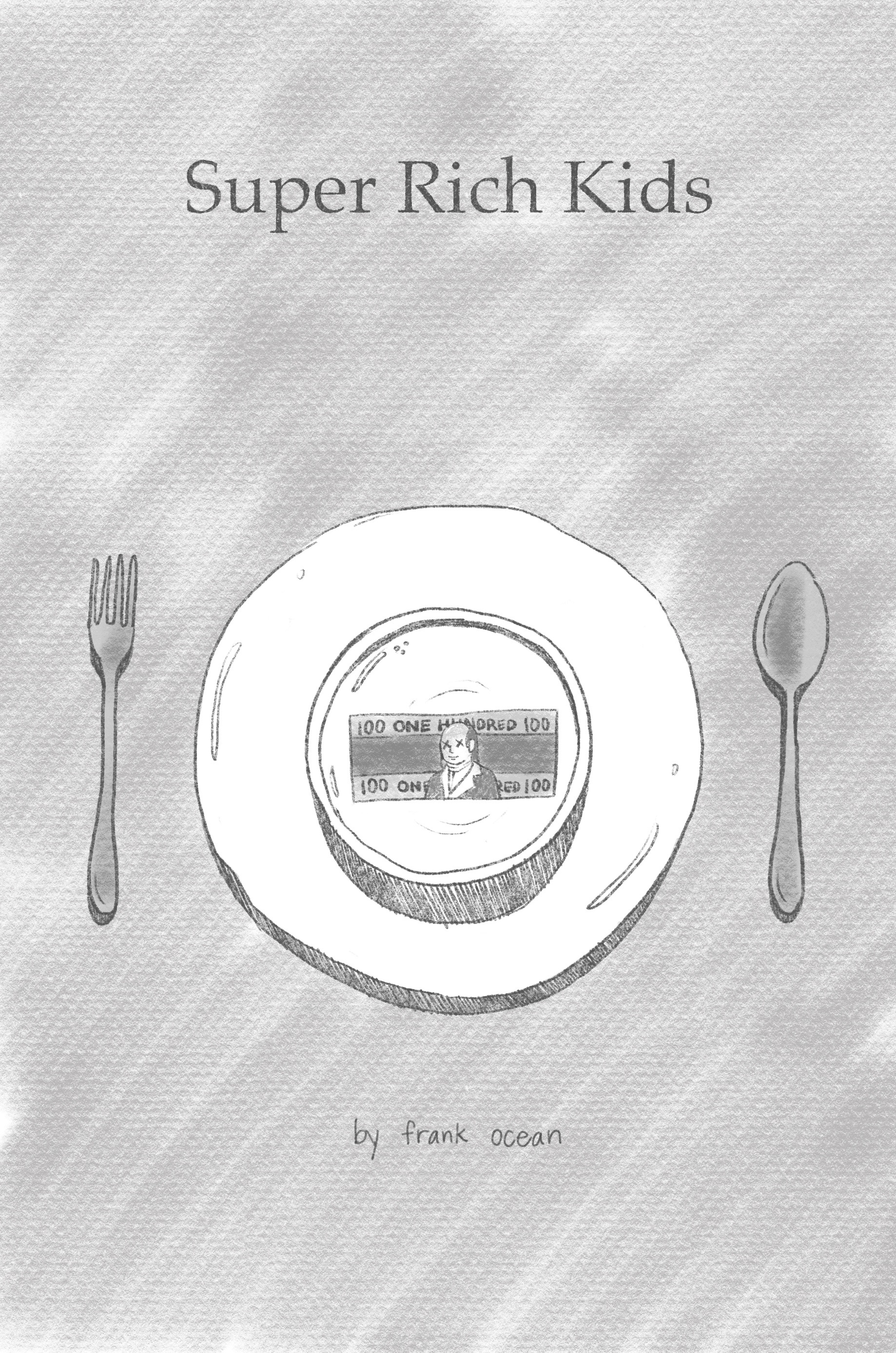
1
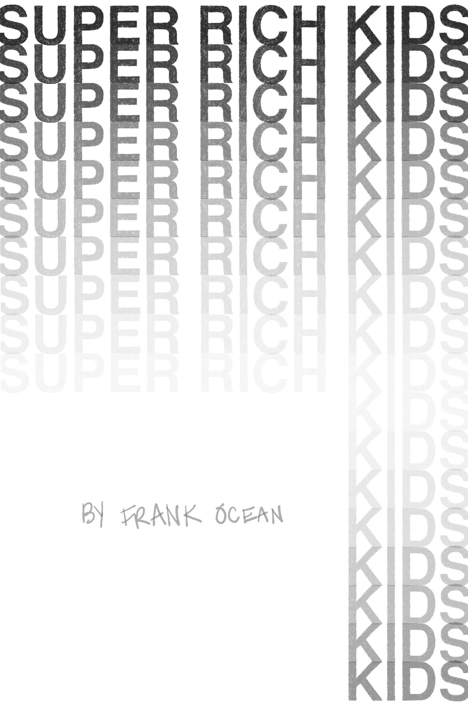
2
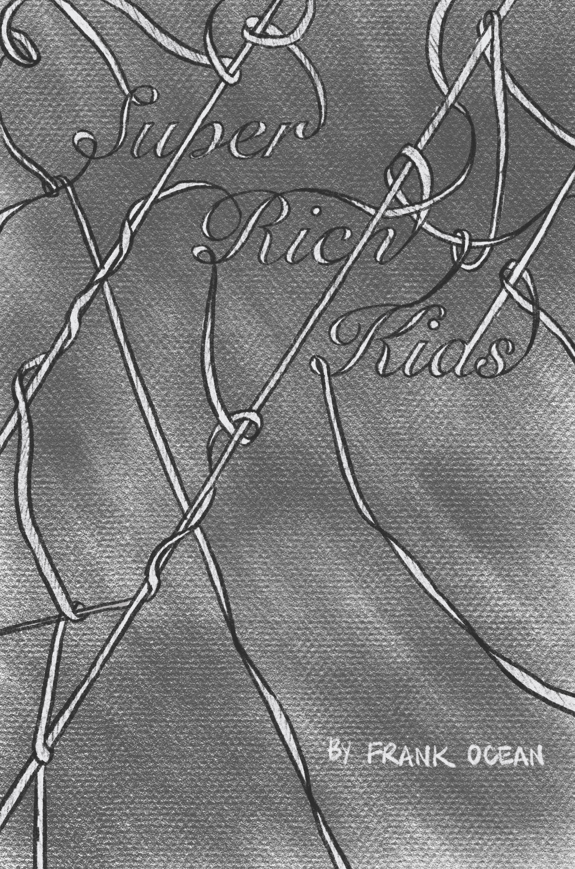
3
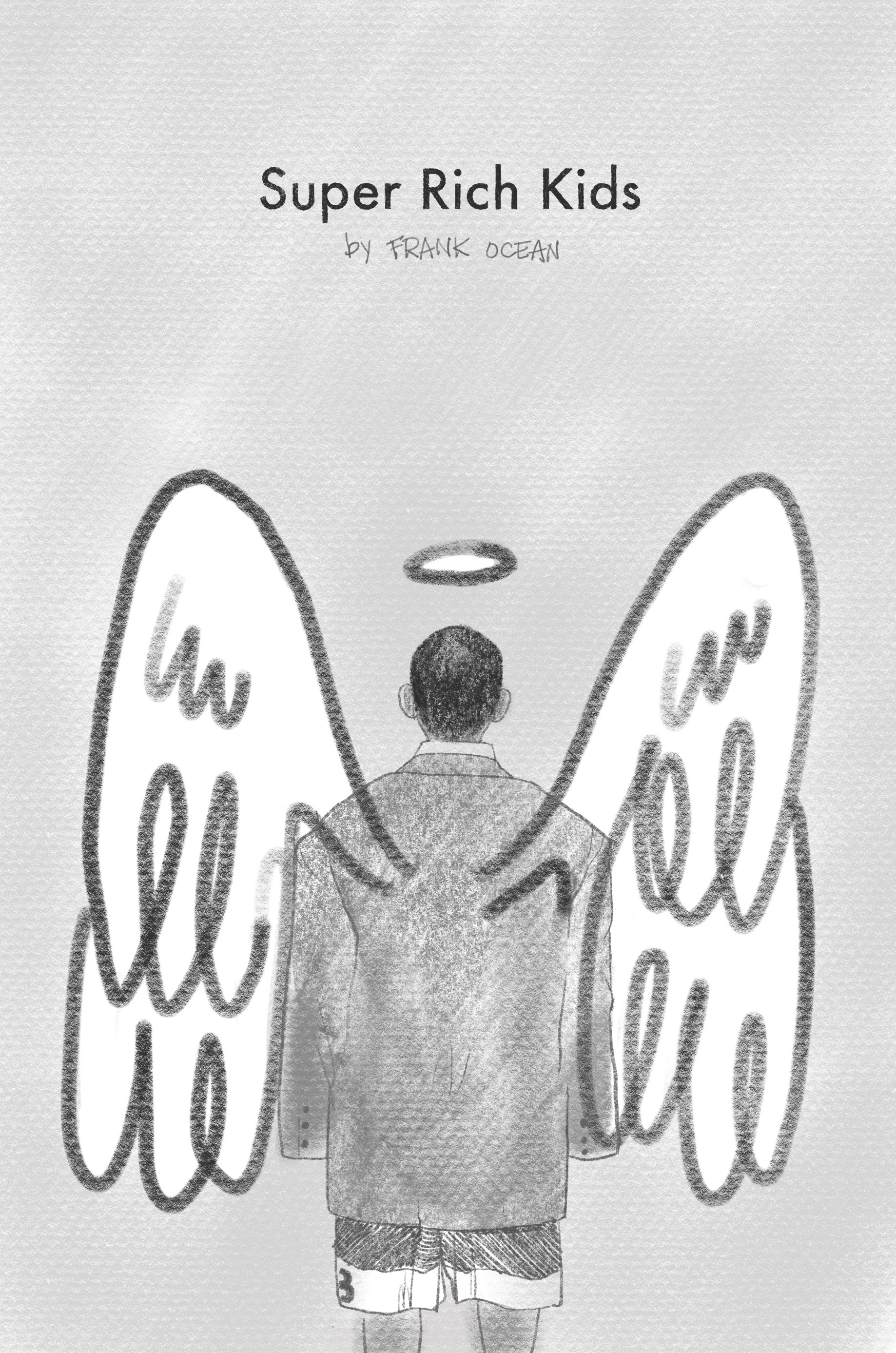
4
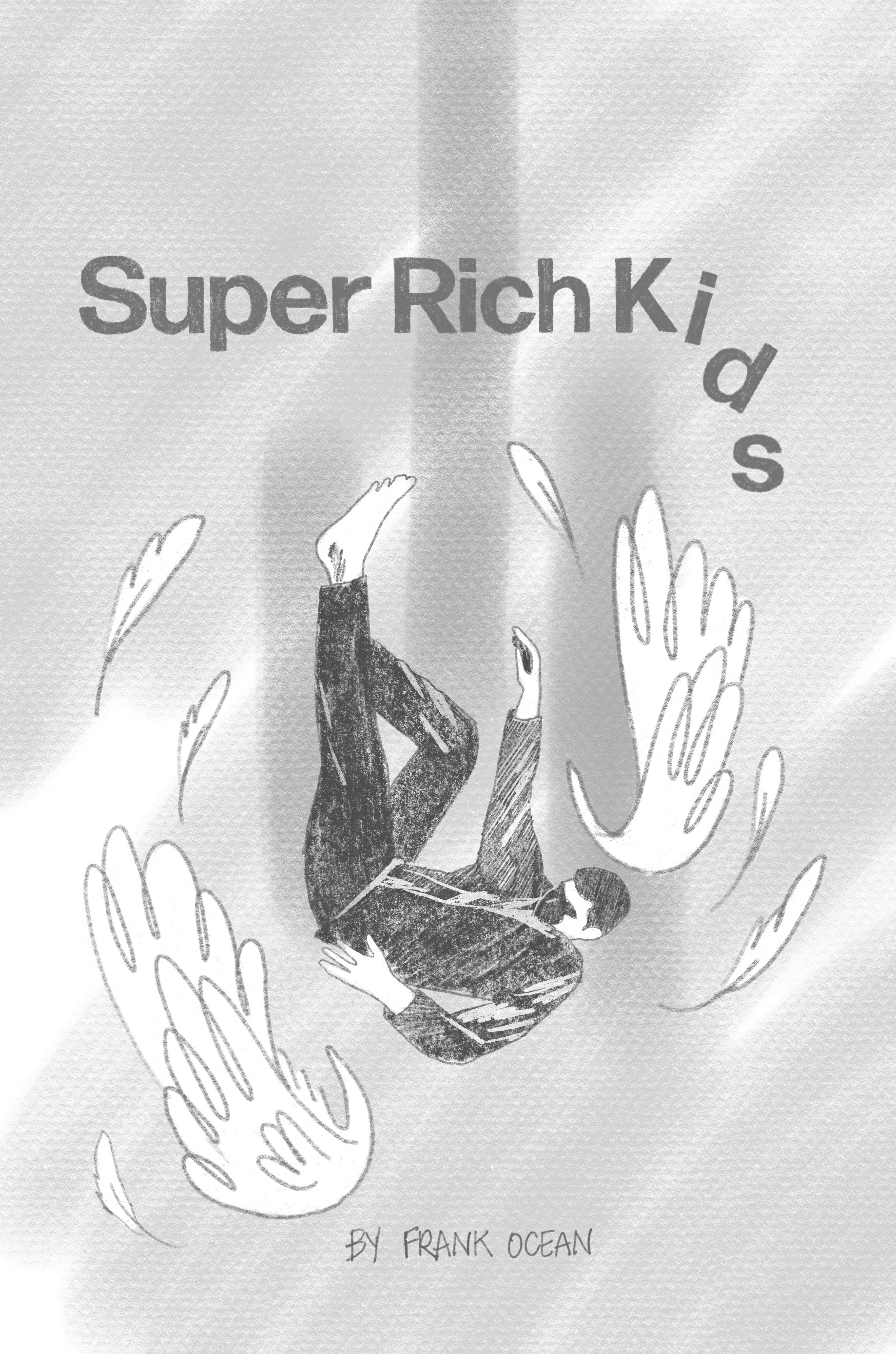
5
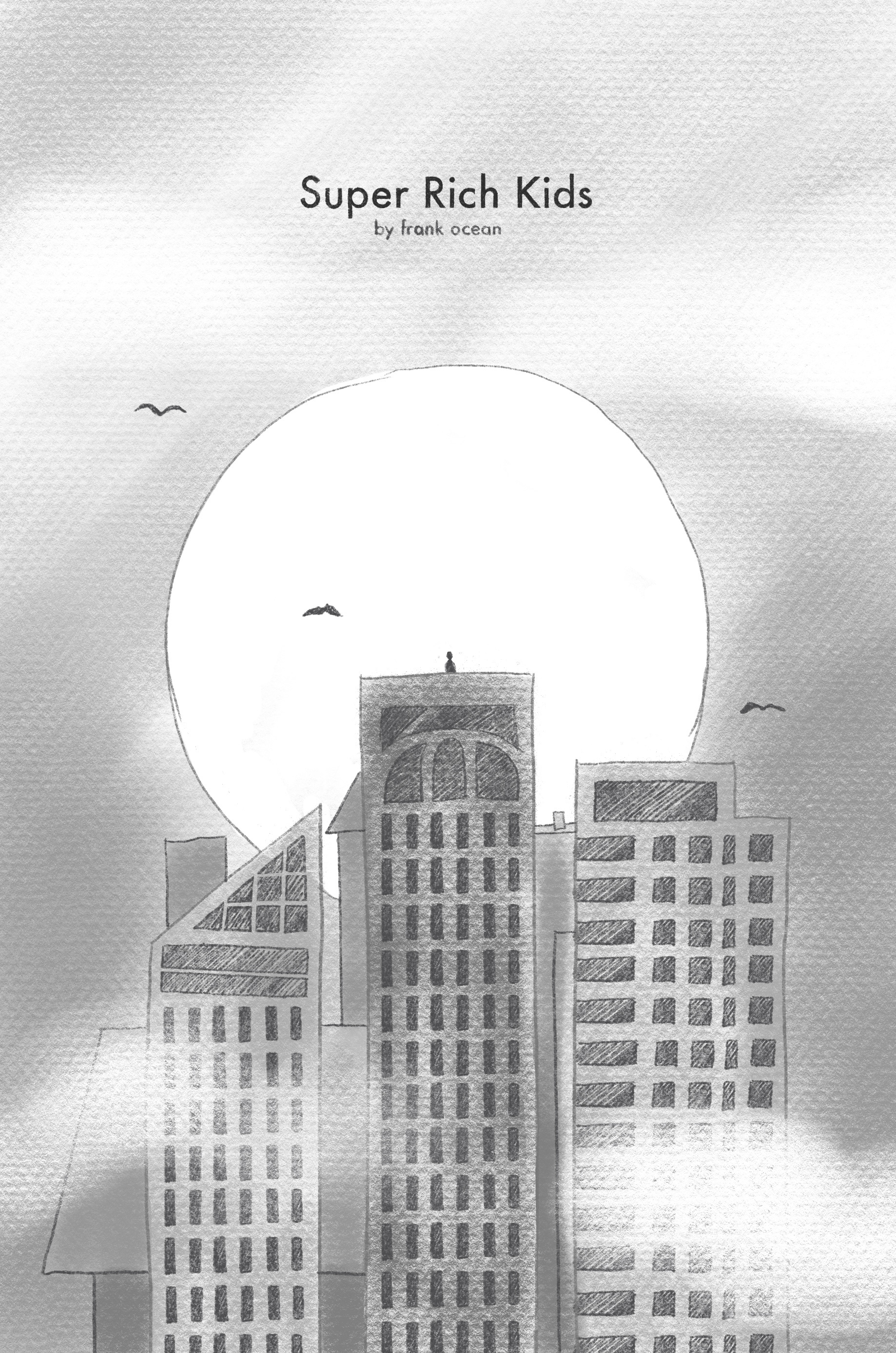
6
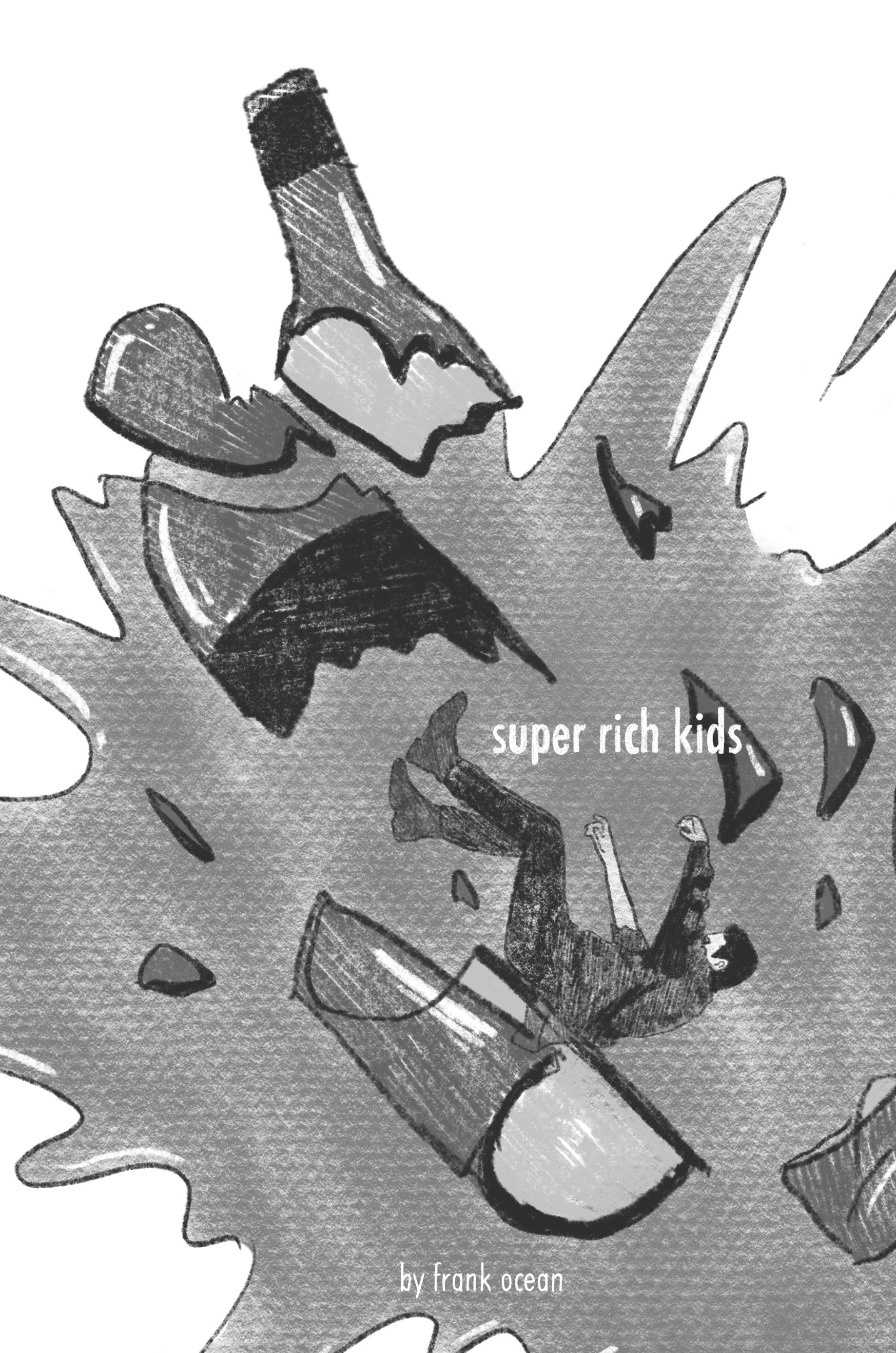
7
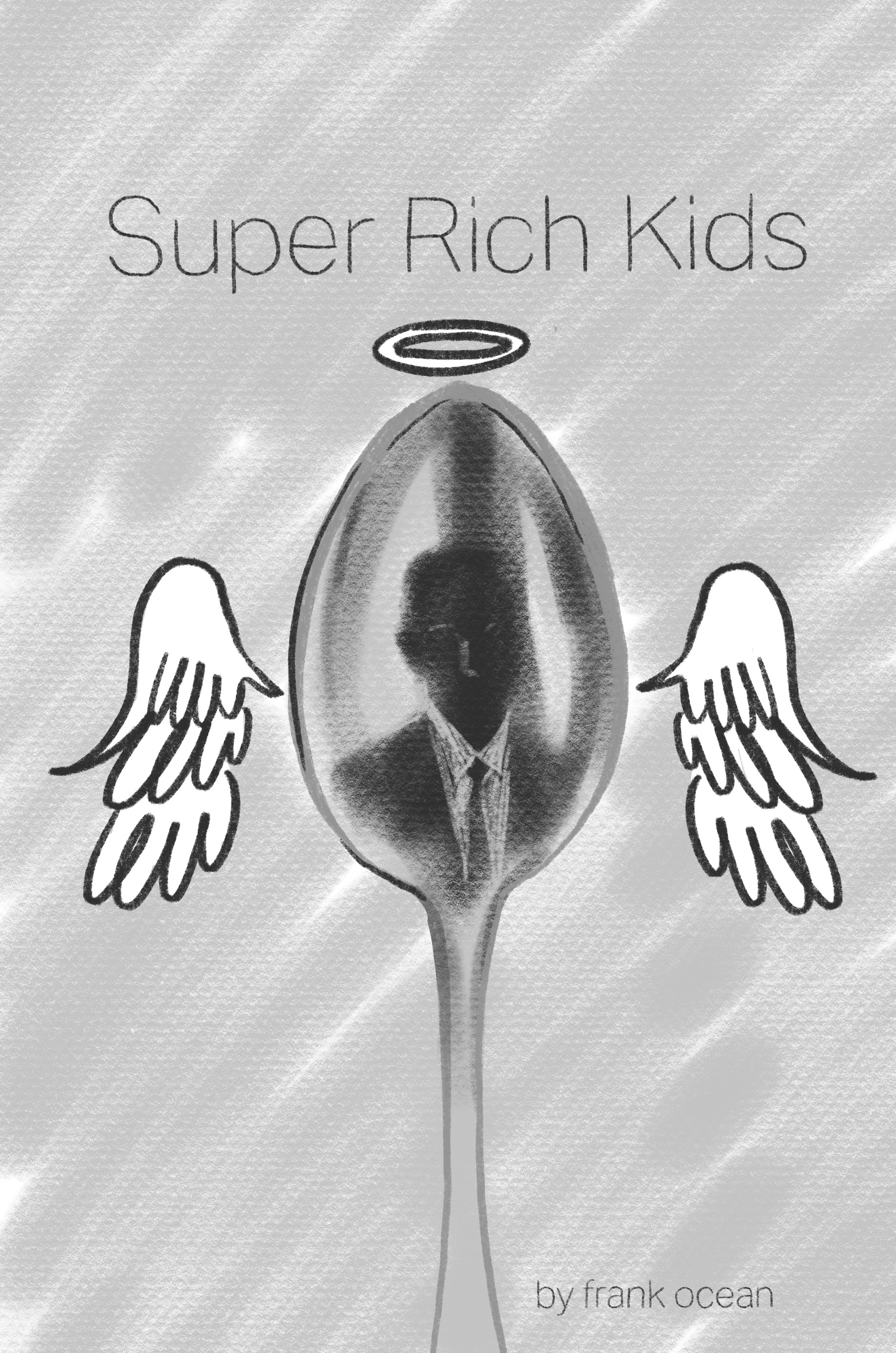
8
9
10
11
12
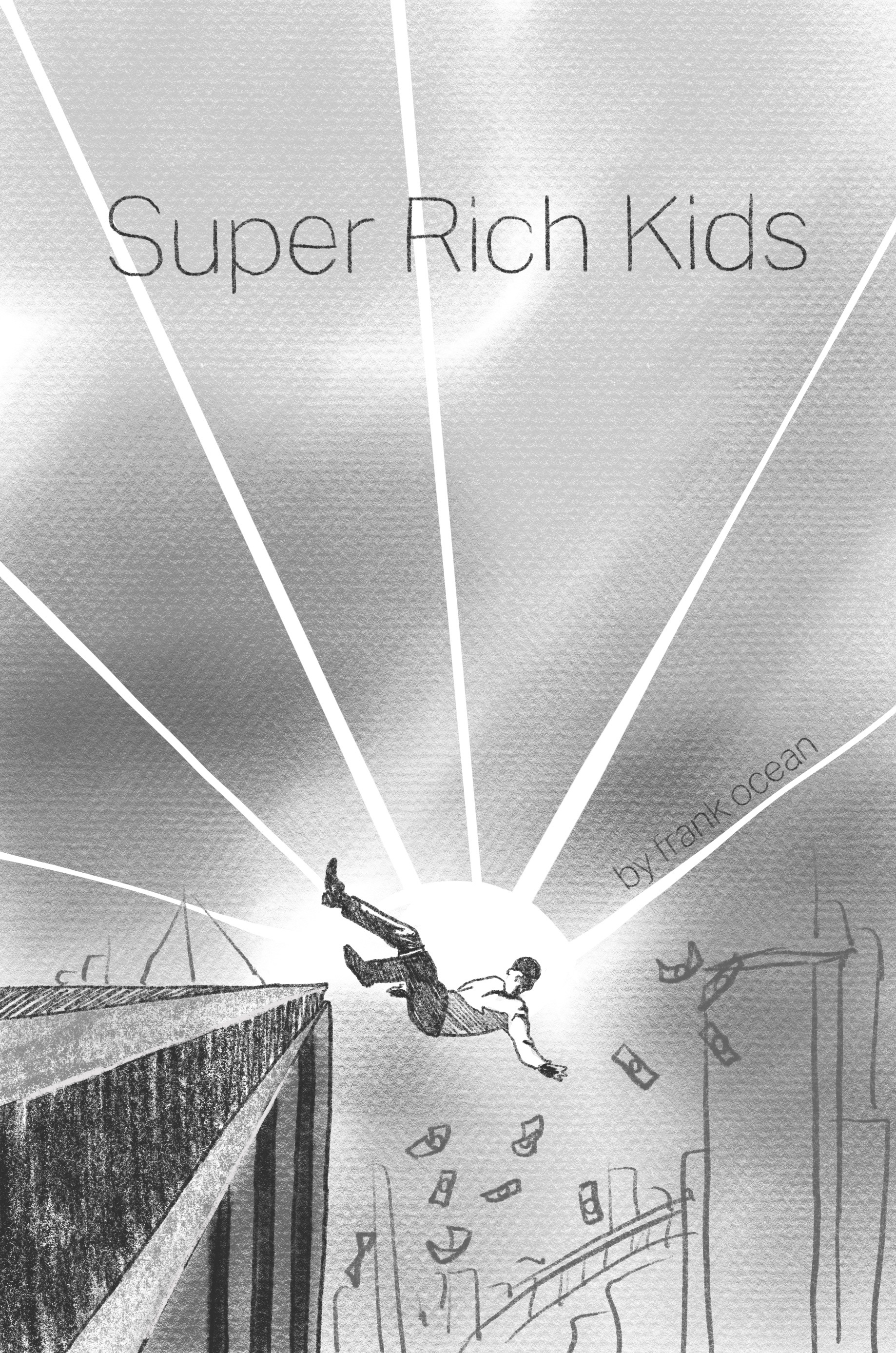
13
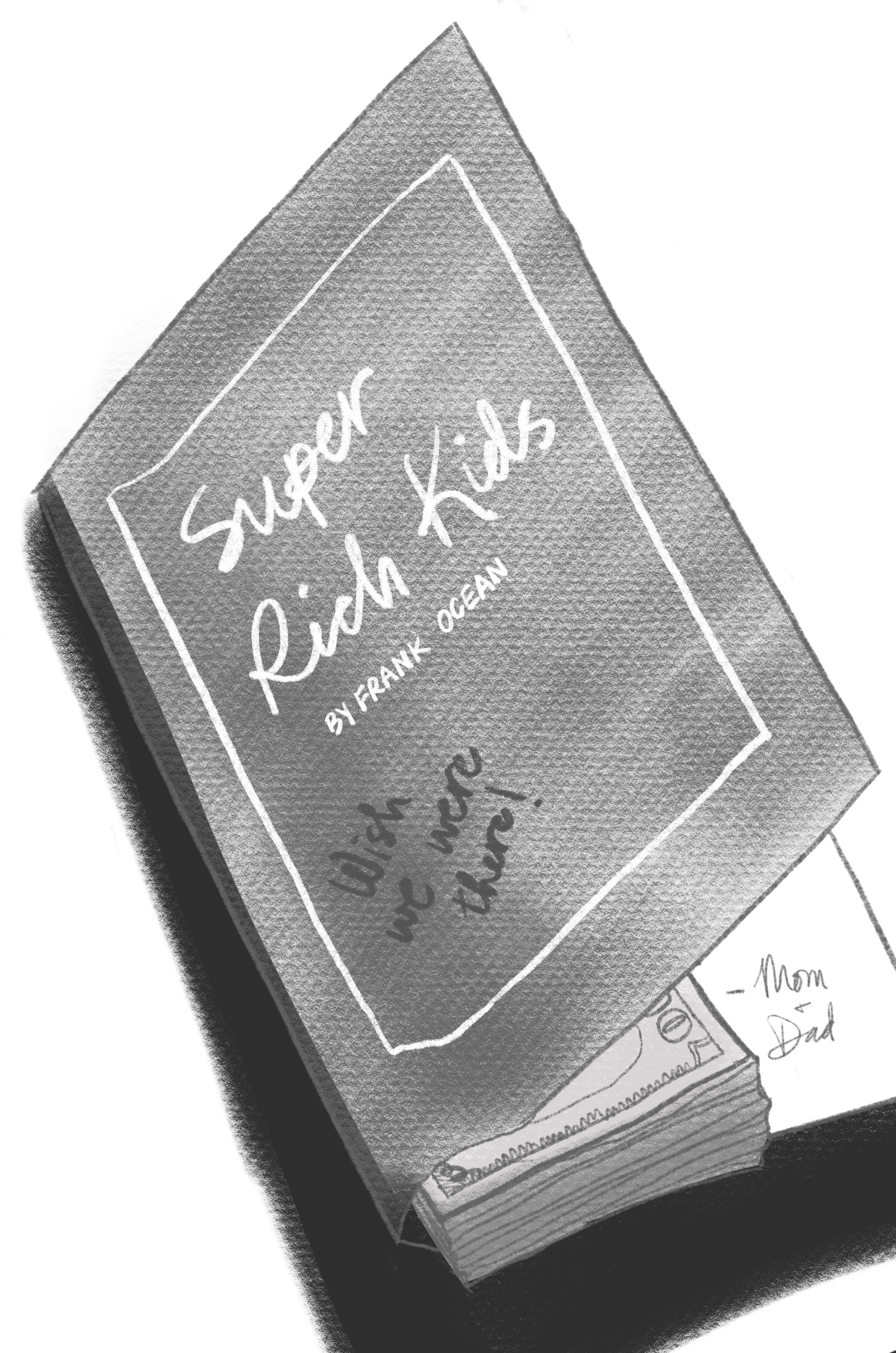
14
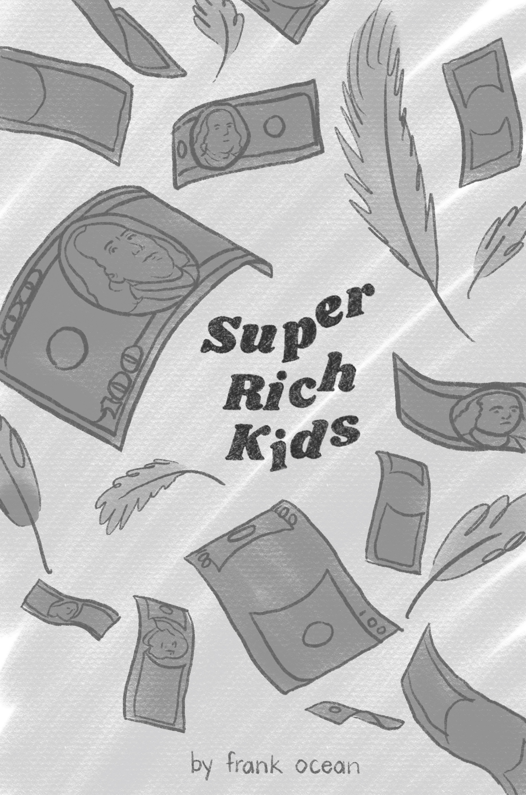
15
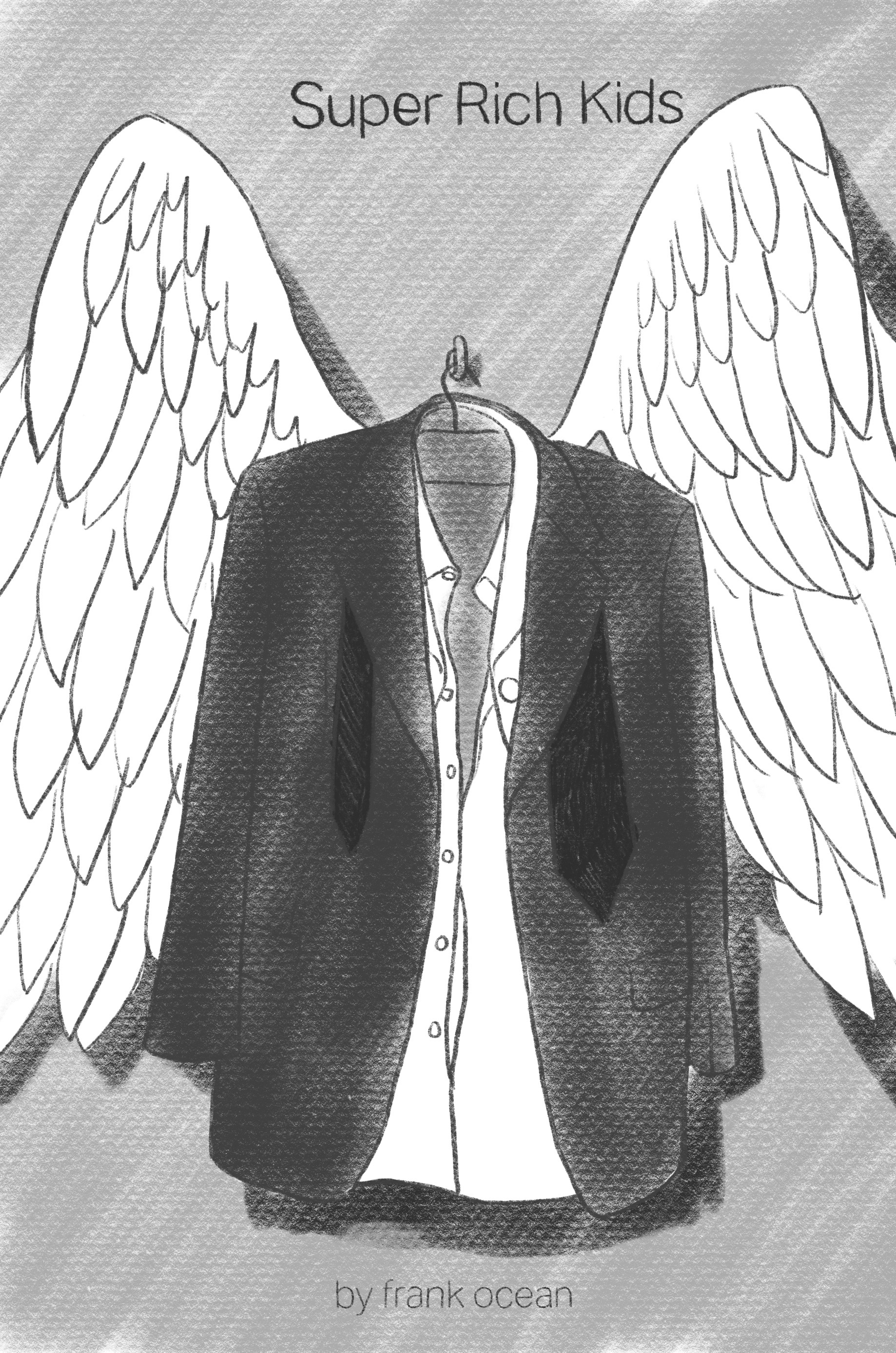
16

17
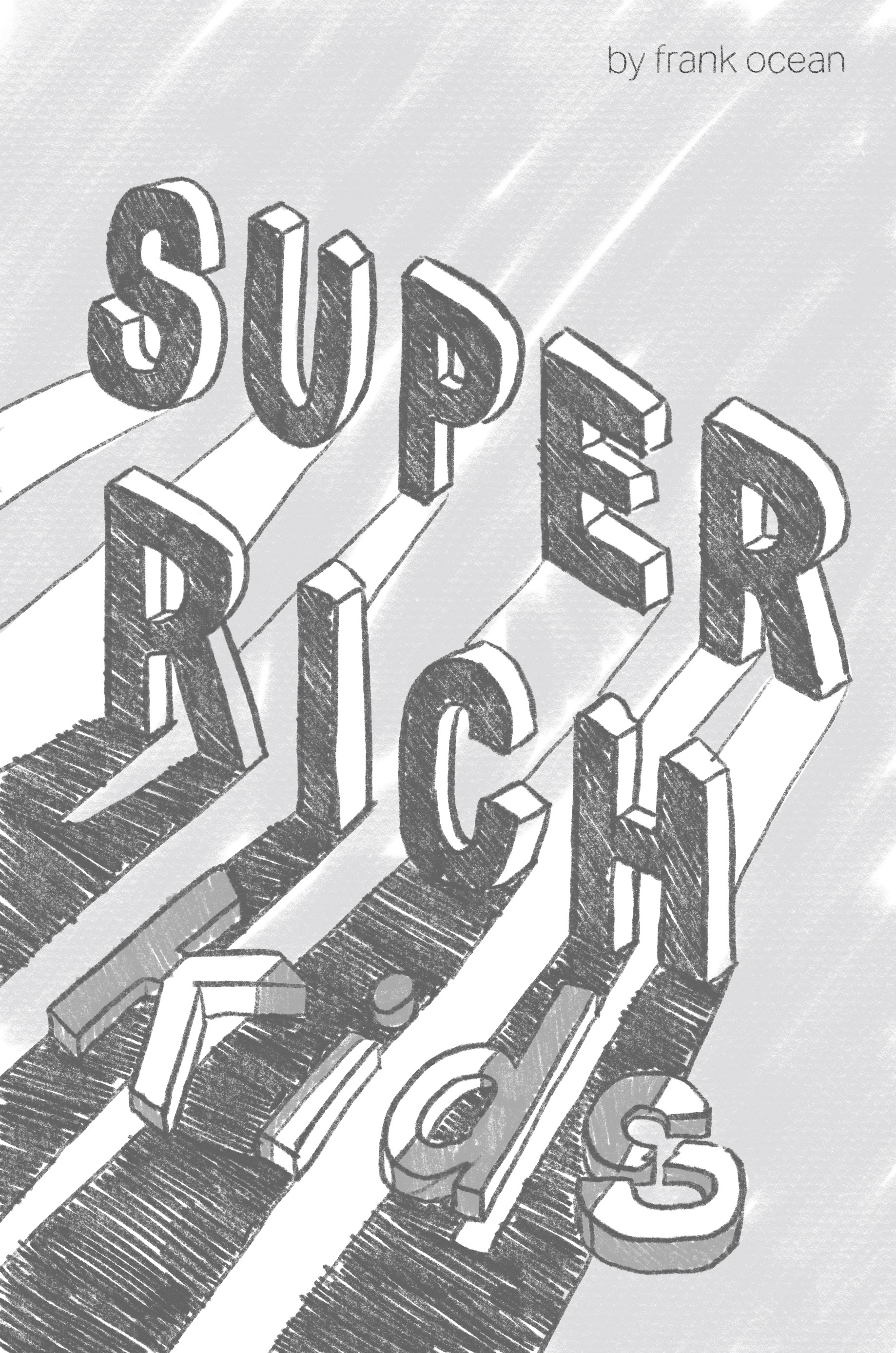
18
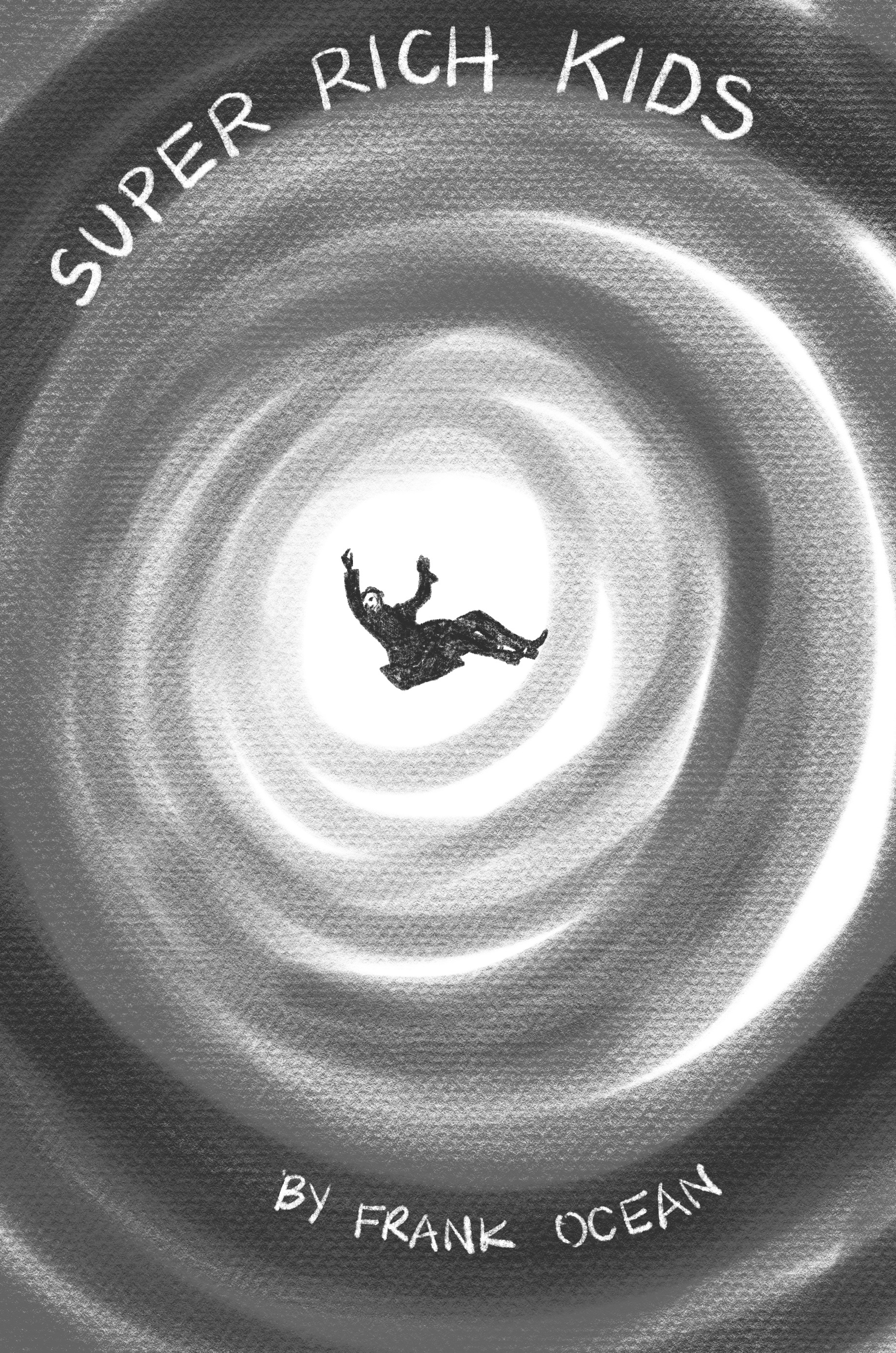
19
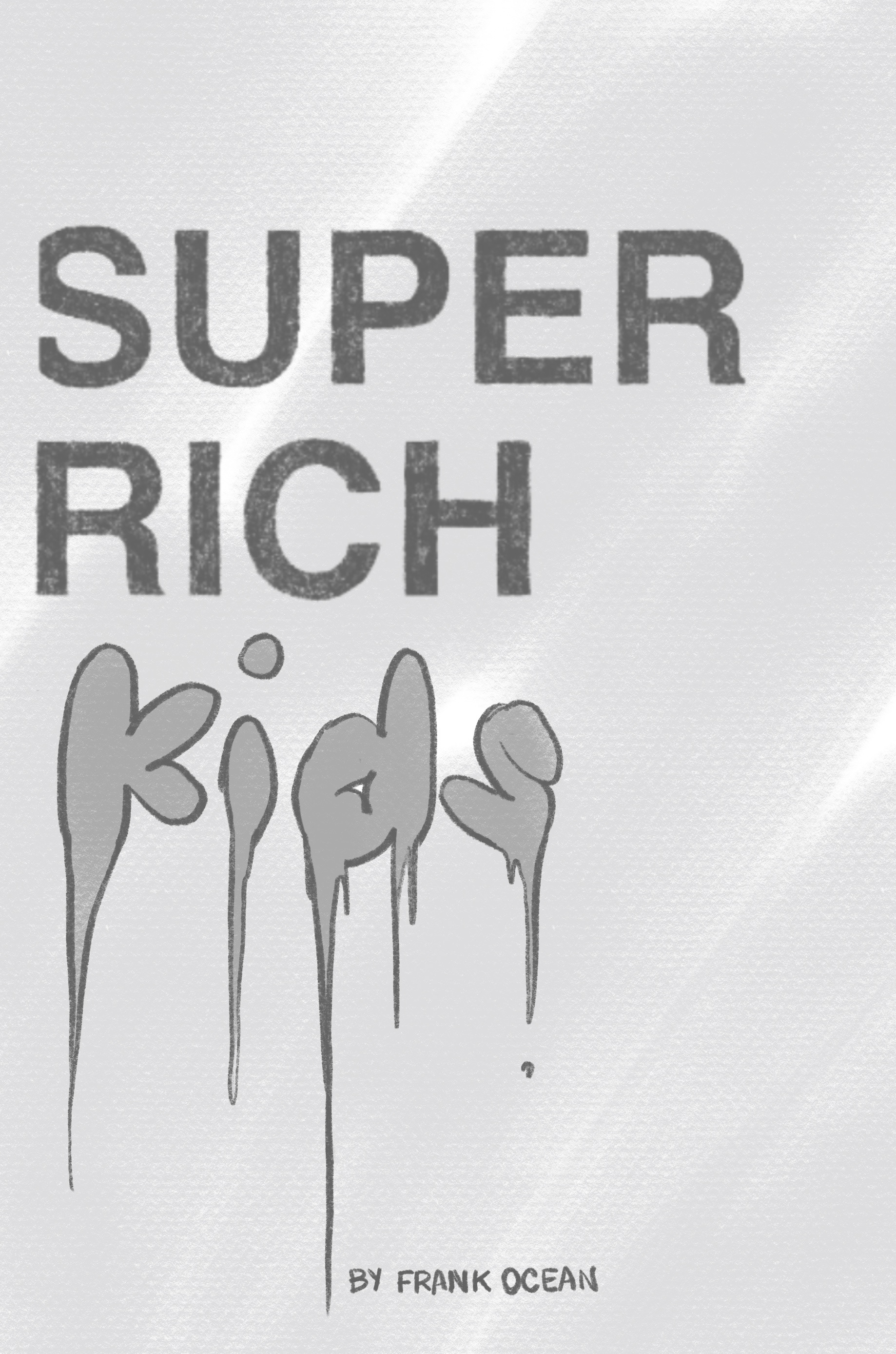
20
Process
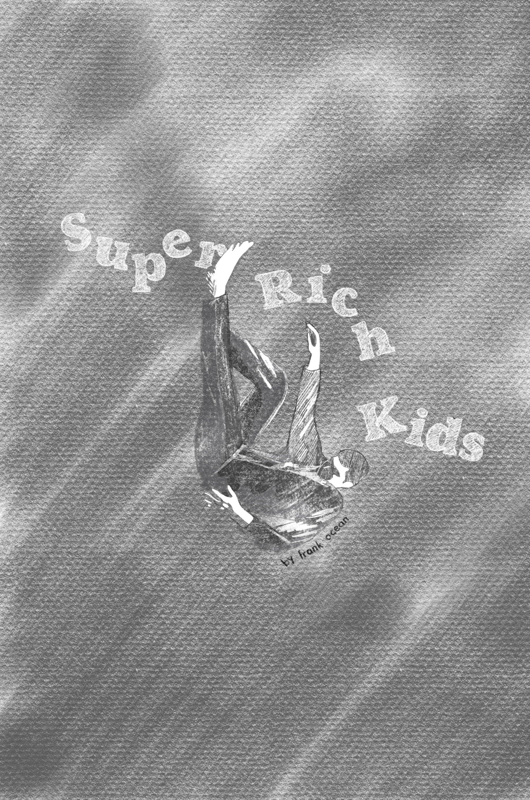
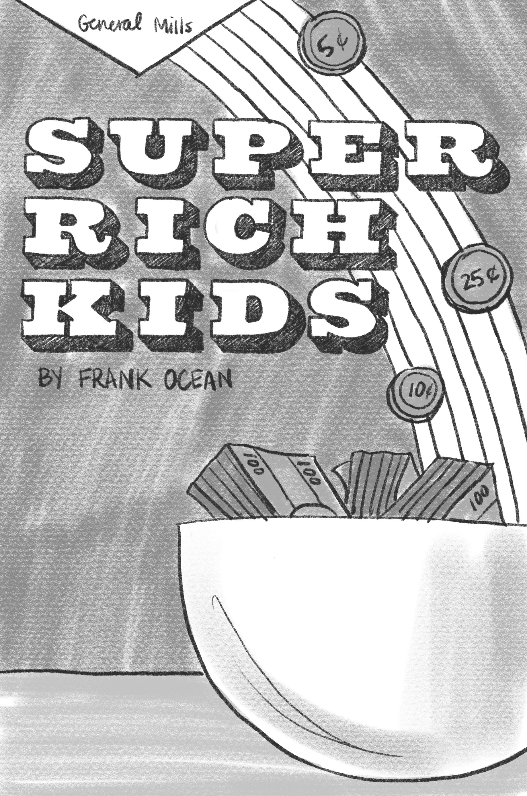
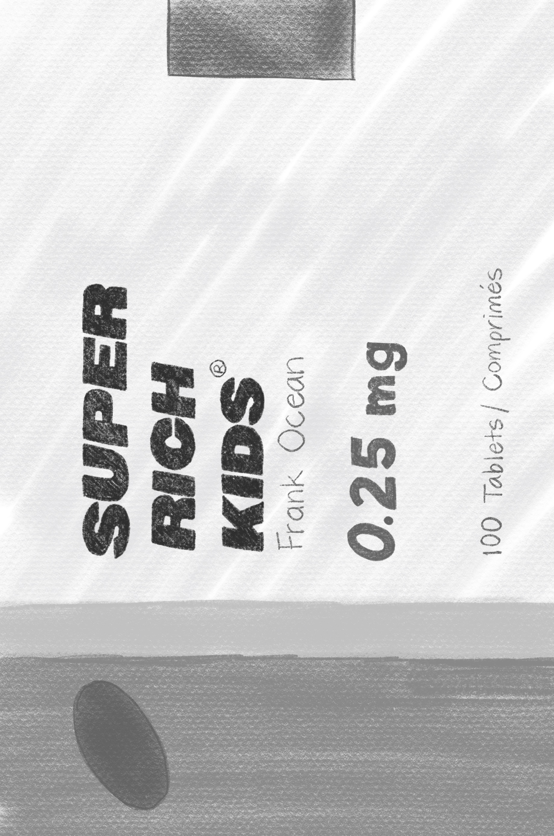
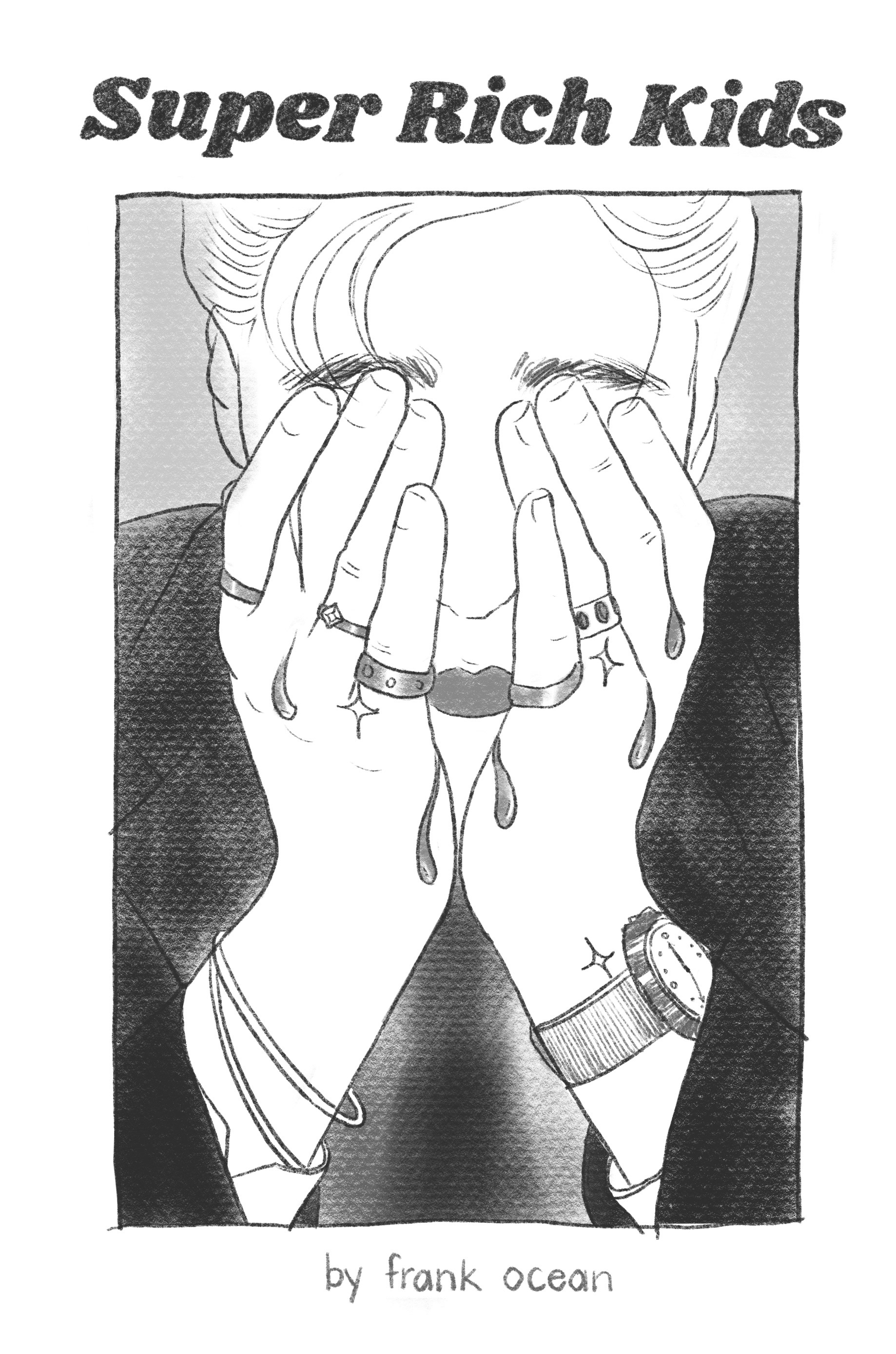
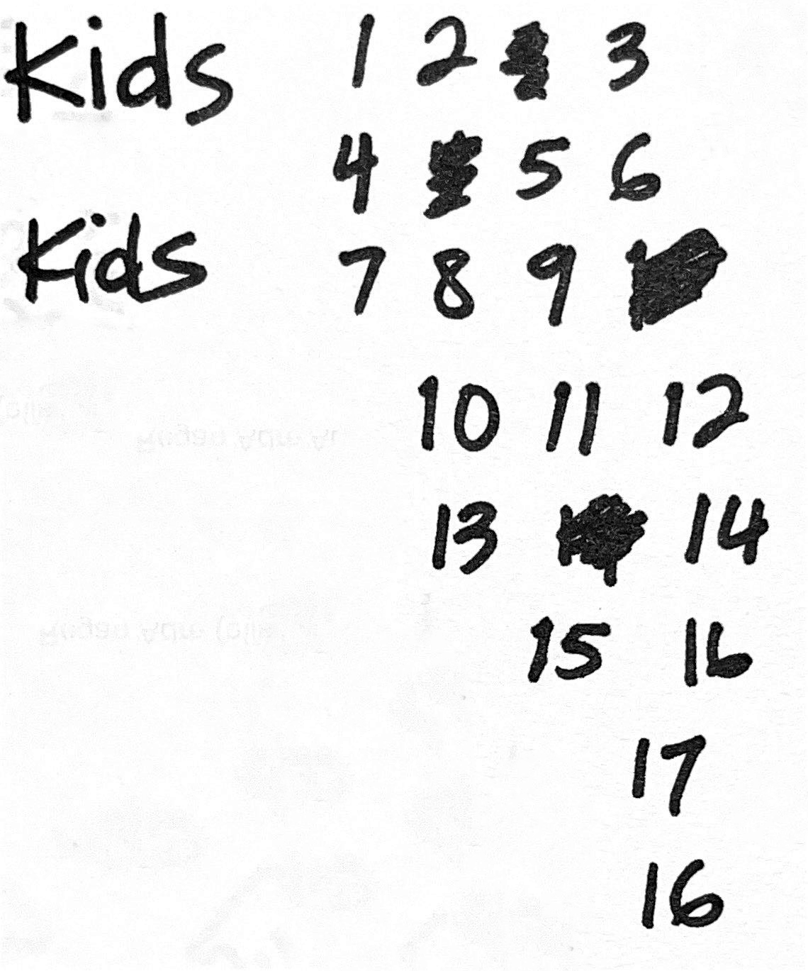
I started off with 20 initial thumbnail sketches for the front cover, all of which allude to the song's themes of wealth. I really wanted to incorporate the falling man and the wings motif in some way since they are both critical points of the story. I decided not to use any actual buildings in the final composition because it felt too “on the nose” for what goes on in the story. The final cover incorporates the font and styling of the title in thumbnail #5 with the graphic drawing style of the wings in thumbnail #8. I intended to give the cover plenty of whitespace to keep the focus on the falling man. I added the cracked glass texture as a more subtle reference to the city buildings.
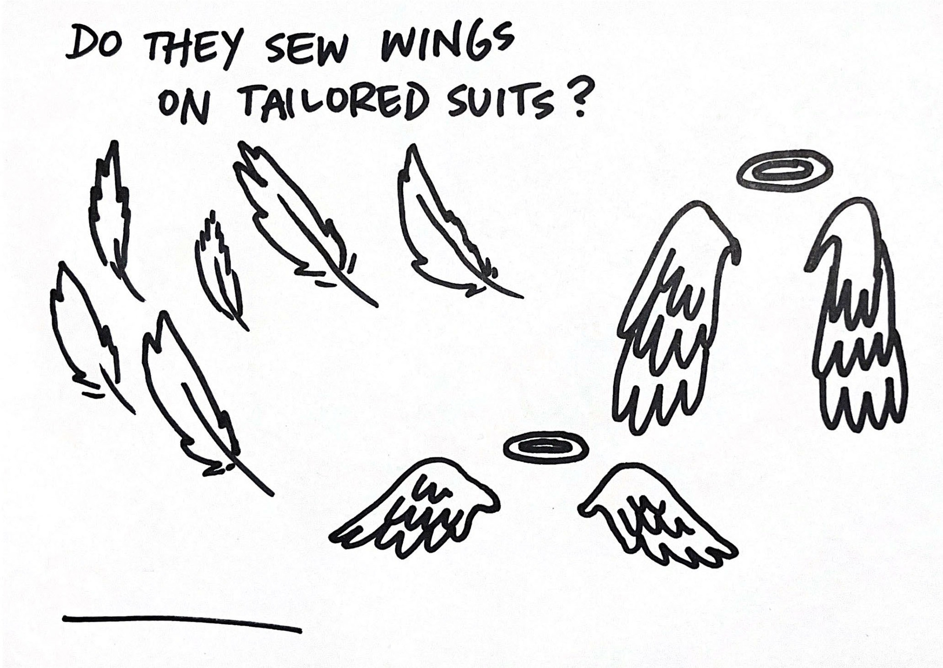
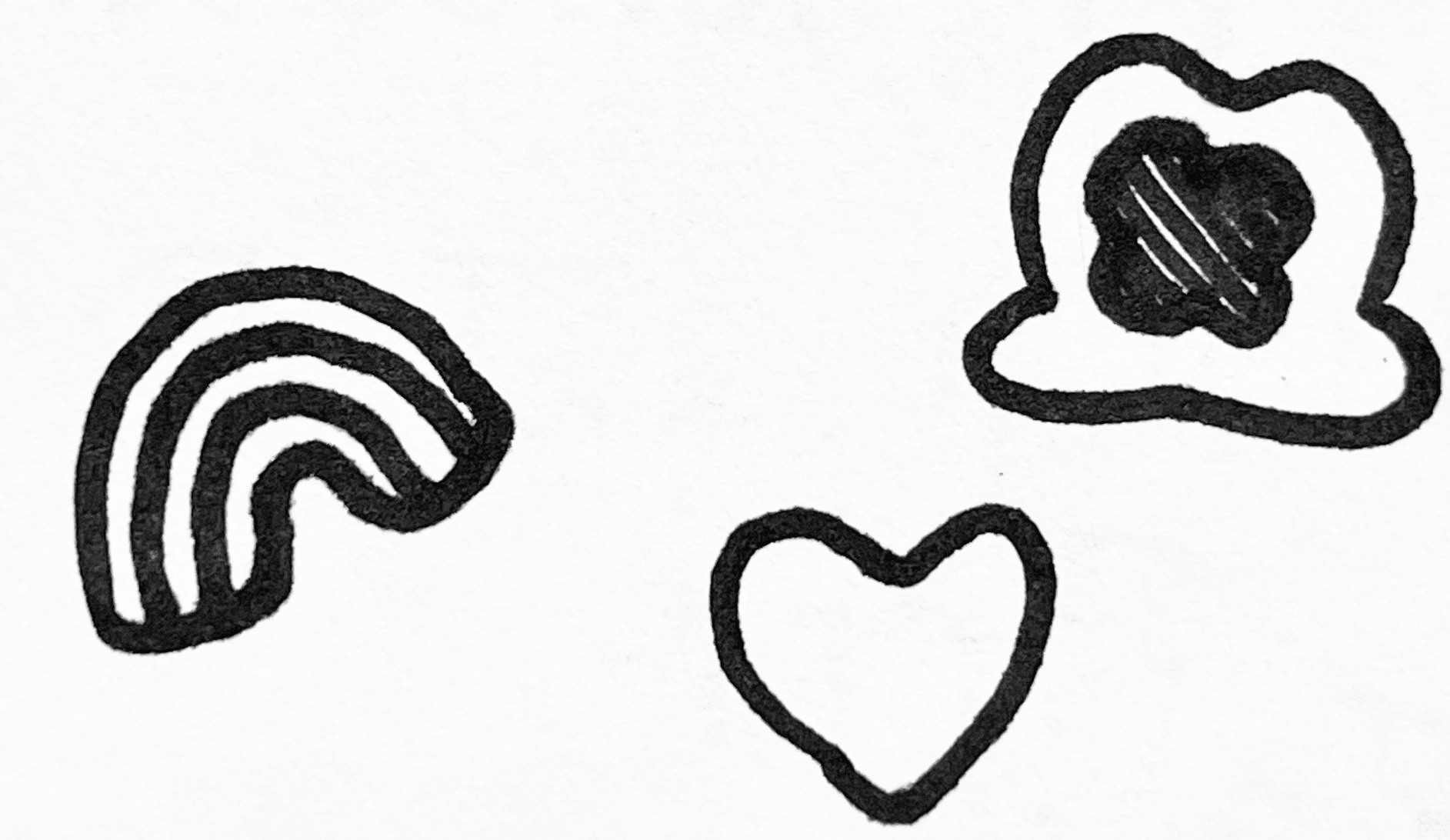
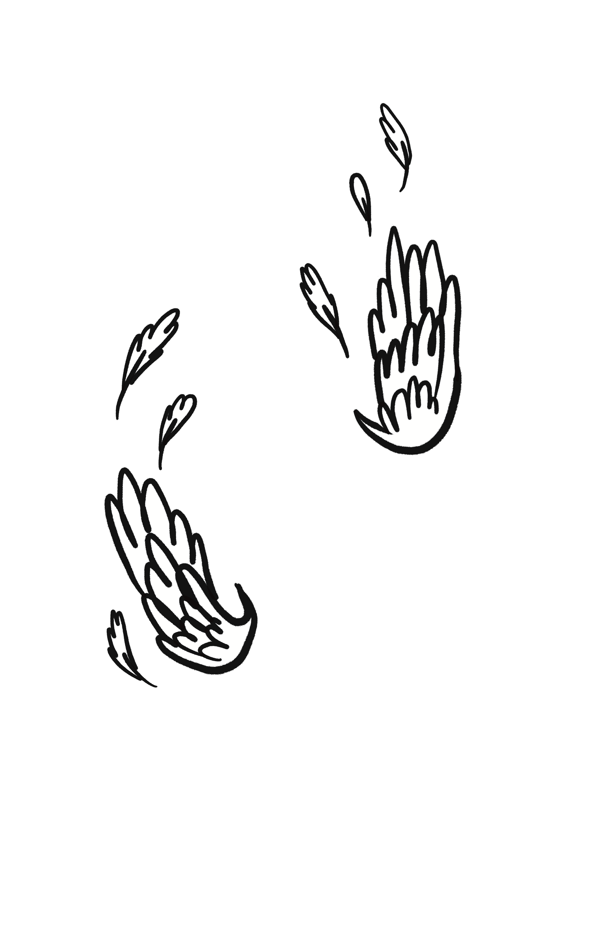
Since the graphic drawing style of the wings and the other illustrations are meant to emulate the doodles that the teenage main character may have drawn, I chose to draw the illustrations and write some of the copy myself using a Sharpie marker.

